Contrast
Vuejs
vuejs.org

Contrast compels the observer to notice important details within the work.
In this case the background is solid black, and the more noticeable elements
of this web page are the title, which is a blue green gradient color scheme
as well as a large heavy font, and the get started button which is colored
green and when examined more closely does not have black text but a dark blue
color. These elements as well as the banner at the top stand out because they
are the only ones that are colored.
Hick's Law
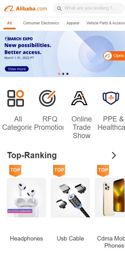
Alibaba
alibaba.com

Hicks law describes the time it takes for a person to decide as a result of the
possible choices. The greater number of choices there are, the longer amount
of time it will take to decide. Alibaba’s website it is packed with as many
choices as I've ever seen. I suppose the goal of this is to keep the user on
the page for as long as possible.
Visual Hierarchy
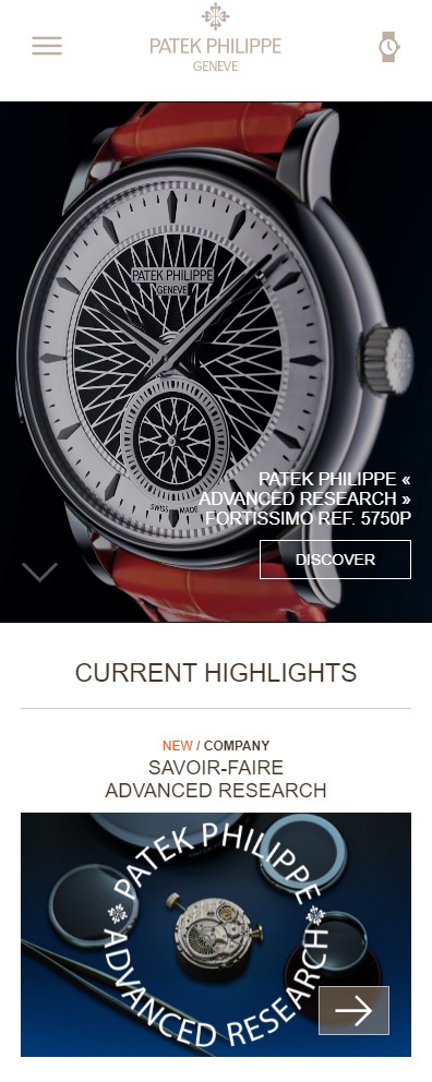
Patek Philippe
patek.com

Visual hierarchy is the strategic placement of elements designed to influence users’
perceptions and guide them to desired actions. Notice that on the front page of the
Patek website, the biggest element is the picture of a watch that they are promoting.
This is to draw the user’s attention first, and designed in a way that the quality
and craftsmanship of the watch “stands out”


